Winona Area Public Schools: Community Contribution
Winona Area Public Schools Data Visualization
Introduction:
This project addresses the need of communication of public school data to community members in a meaningful way. Also, making the data available to general public in a proper and useable format.
There has been a wider discussion regarding the budget issue in Winona area schools. Here is the article discussing the budget concerns.
Primarily, this project was focused on cleaning and visualizing the Enrollment, Expenditures and Staffing History reports of the Winona Area Public District (WAPS) available publicly through Minnesota Department of Education, Data Center.
Link: http://education.state.mn.us/MDE/Data/
Methods and Steps of Project
1. Data Inspection/Acquisition
Public data was collected by Alison Quam (Representative from WAPS District). The data were made available in different PDF/Excel files. Also, the information were scattered in different files.
2. Data Cleaning and Formatting
First, most of the PDF files were converted to Excel by Tabula and online tool (pdftoexcel.com). Then, they were cleaned up in proper format and stacked using Python (Pandas).
3. Data Exploration and Visualization
This part of the project is focused on addressing the questions provided by representative of WAPS (Alison Quam). Tableau was used extensively to explore the data and visualize it.
Primarily, I focused on answering following questions:
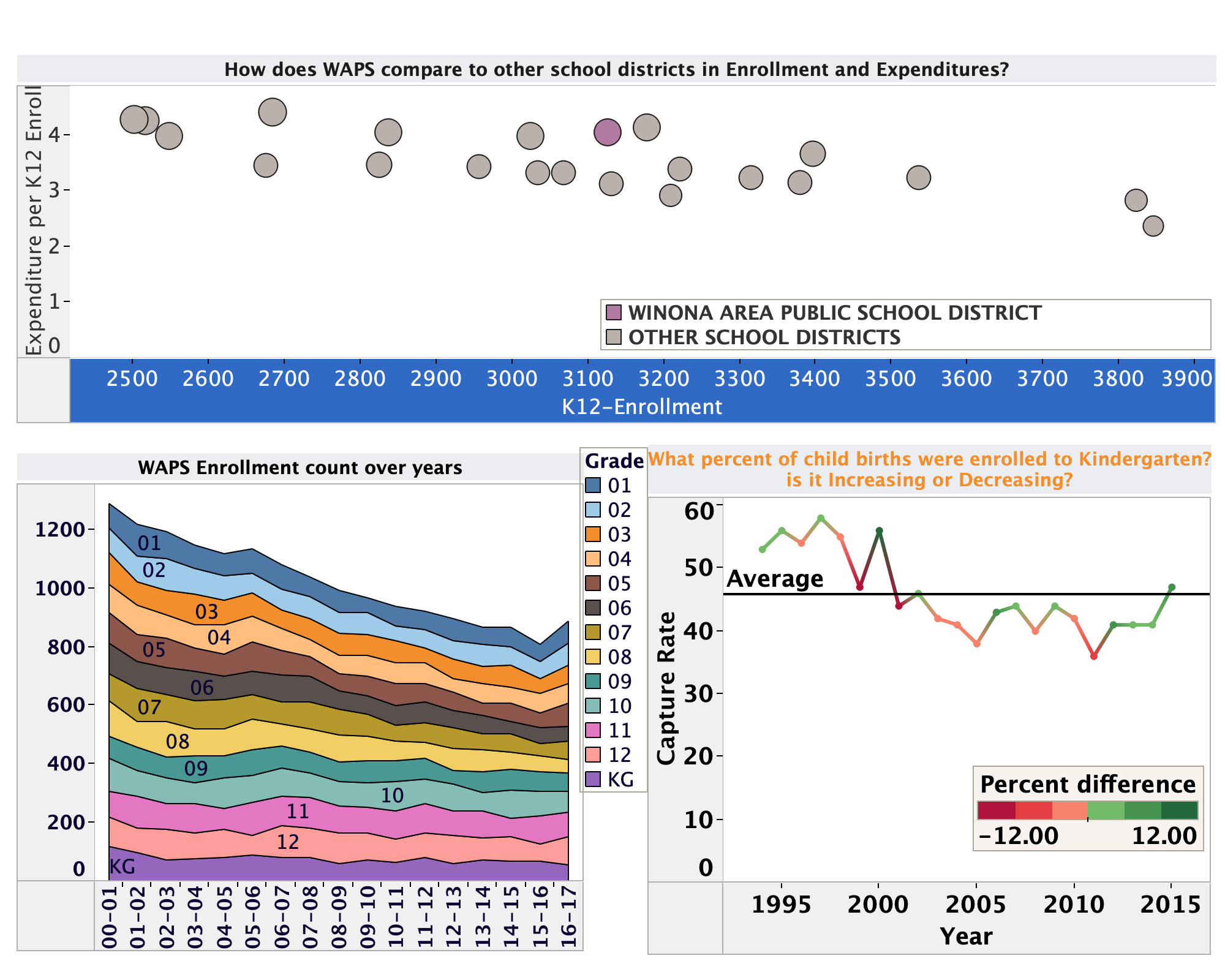
- I was curious about, how does the enrollment and capture rate (rate of new born enrolling to Kindergarten) is changing in WAPS district?
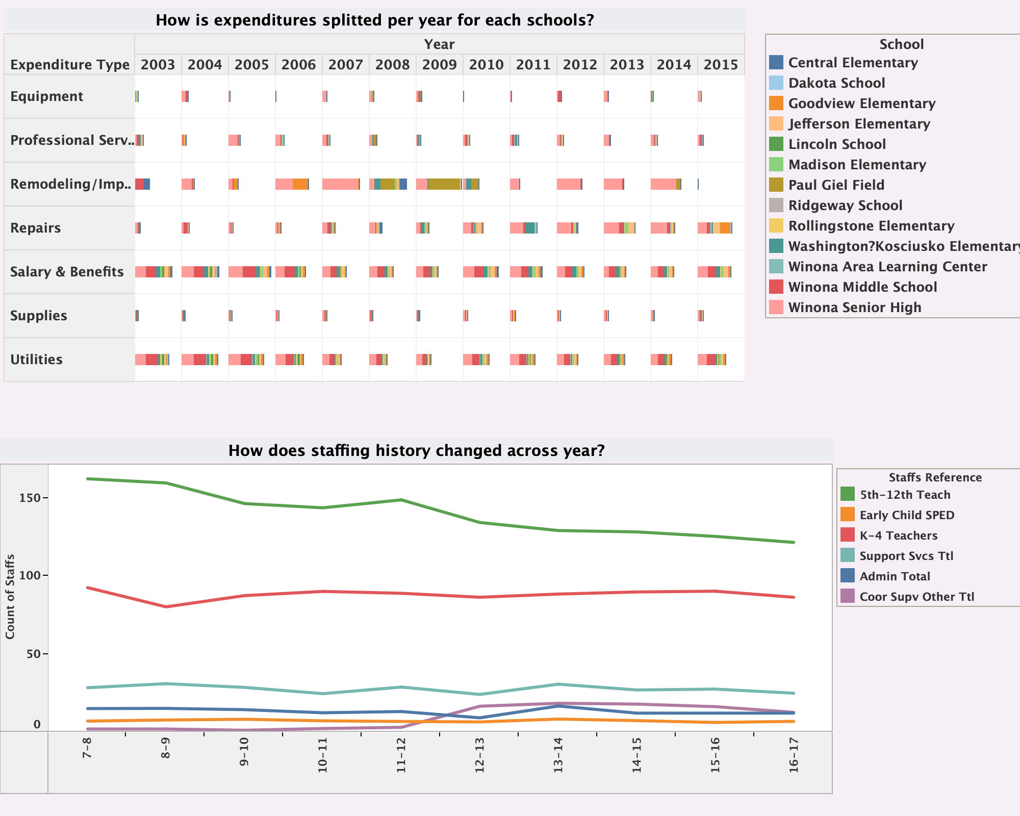
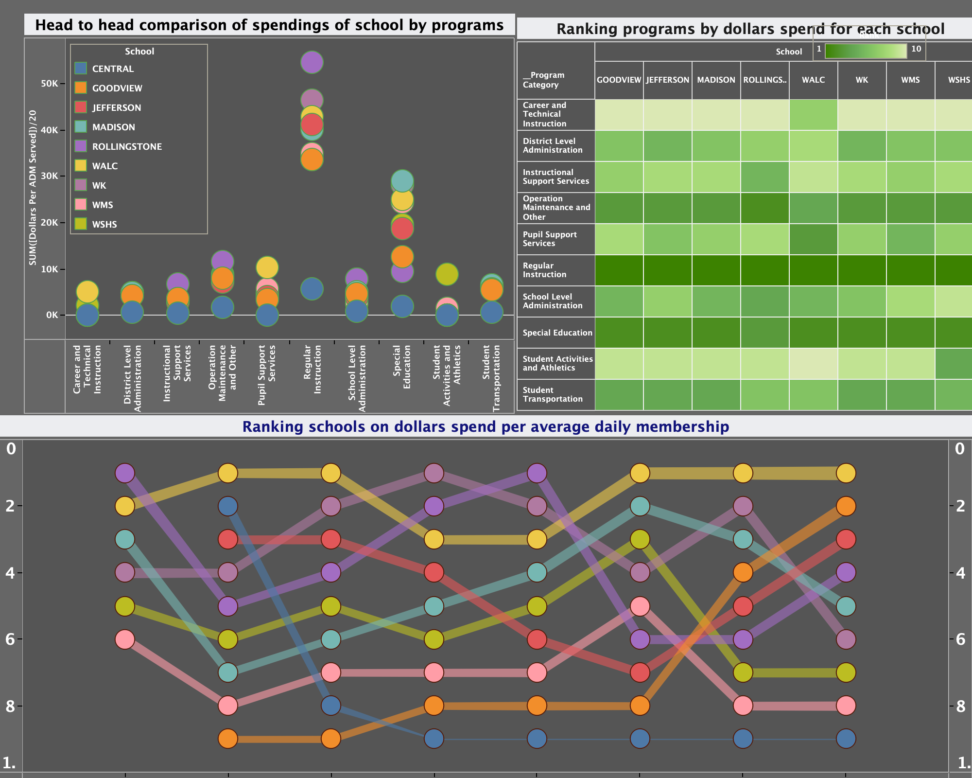
After few meetings with representative, I realized she was more curious about how schools spend across different programs.
- How the expenditure per average daily membership (count of student daily served in schools) and spending on various category is changing?
Interactive Tableau Dashboard
The link to the tableau file and the data is here.
Visual Story
Now, the visual story begins…
The following images show the key insights from the Tableau dashboard:
Impact and Conclusion
This project actually helped inform the decision makers at local level. Thus, I was able to contribute to something meaningful with my Python and Tableau skills.
The visualization provided clear insights into: - Enrollment trends and capture rates over time - Expenditure patterns across different programs - Resource allocation efficiency - Budget planning considerations
Acknowledgements
I would like to thank: - Alison Quam (WAPS representative) for providing the data and guidance - Prof. Silas Bergen for helping and guiding me to understand the terms and calculations already done in the reports - Prof. Todd Iverson for help figuring out Python code for cleaning the data
This project demonstrates how data science skills can be applied to serve the community and support informed decision-making in public education.